New Dynasty Tool Tutorial: Coaching History
As part of DLF’s recent acquisition of FFStatistics, we are pleased to announce that the integration of tools has begun and they will soon be readily available to our premium subscribers. As each new resource is released, it will be accompanied by a “how-to” in order to familiarize our readers with the best way to utilize them for fantasy purposes. Up next is the Coaching History App.
Getting Started
When landing on the Coaching History App page, you will be greeted with a tool overview. Start out by selecting the coach you’d like to research and the stats you’d like to view by clicking on “app filters.”
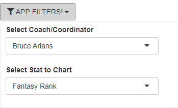
From here, select which tool you would like to use for the selected coach, e.g., Position Rank by Year, Run/Pass Ratio, Total Team Stats, Stats by Position, Coaching Tendencies, or Coaching Tree (available soon).
Position Rank by Year
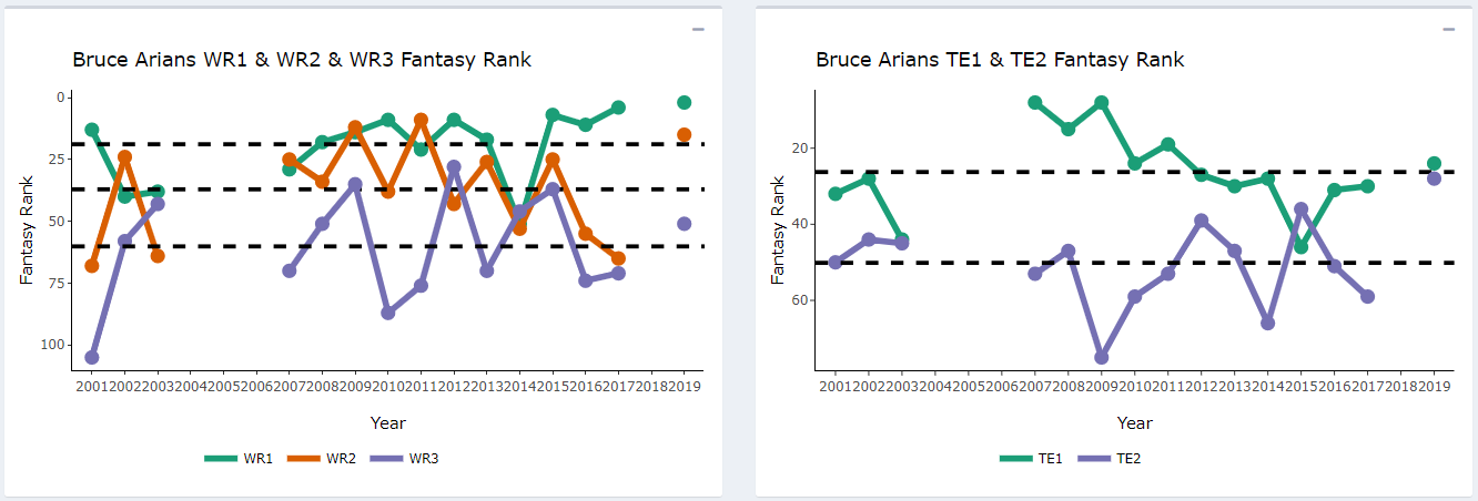
Four charts will graph a coach’s positional players in any offensive stat you choose. Running backs, wide receivers, and tight ends are broken down into positional tiers (RB1, RB2, etc.) based on rush attempts for running backs and targets for wide receivers and tight ends. This is why you may see a WR2 outscore a WR1 in fantasy points on a chart, despite seeing fewer targets. The black dotted lines are the average of the stat you chose for each positional tier.
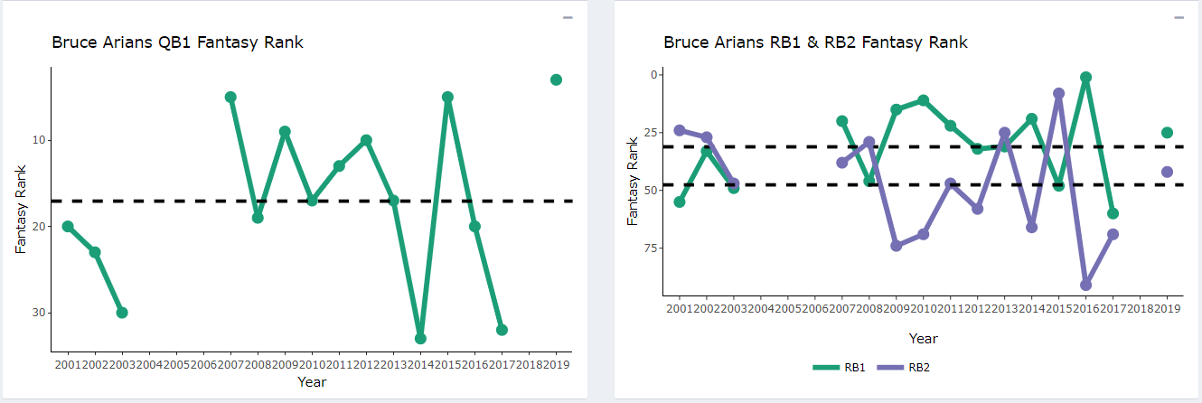
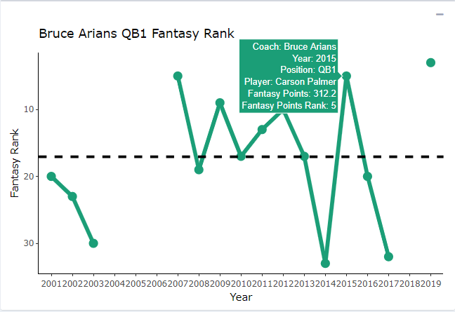
An additional feature is produced when you mouse over a dot on the chart. For example, hovering over QB1 for 2015 provides the following information:
Run/Pass Ratio
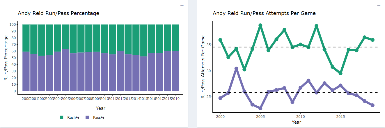
This page presents two charts and a sortable data table. Here you can find stats on a coach’s run-to-pass ratio, total and per game pass attempts and rush attempts, as well as their league rank in rush percentage and pass percentage. The two charts display a coach’s rush and pass percentage by year as well as their passing and rushing attempts per game by year.
Here we look at Andy Reid. You can see that 2019 was his second most pass heavy season as a coach. This is no surprise considering who he has for a starting quarterback.
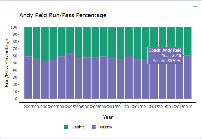
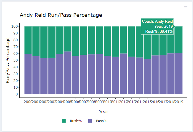
As with the other tools, mouse over the charts to reveal more data. We can see percentages of passes and runs for any particular season.
The data table gets even deeper into the tendencies of the coach or coordinator. By clicking on the column visibility, you can toggle the following options to view.
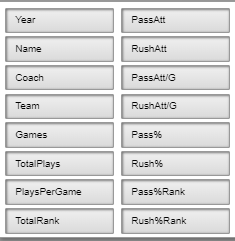
Finally, here is a view of the complete table with all the data you could possibly want.

Total Team Stats
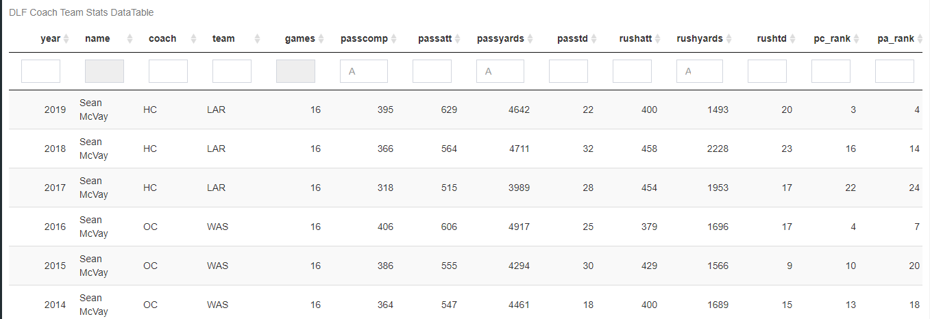
This tool consists of two charts and two sortable data tables. Here you can find stats on a coach’s average points per game and opponent points per game.
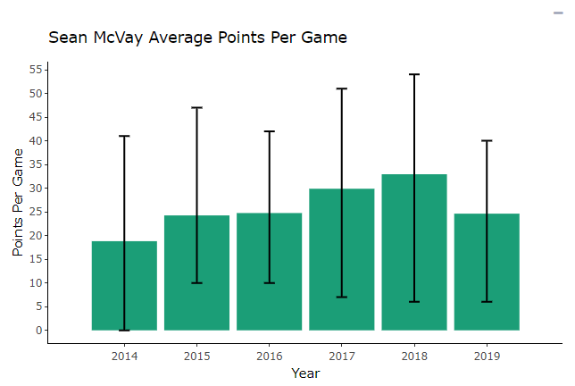
The first chart is a simple bar graph that plots a coach’s points per game each season with bars that show the maximum and minimum points scored in a single game each year. Here we look at Sean McVay.
Yet again, mouse over the table for even more data.
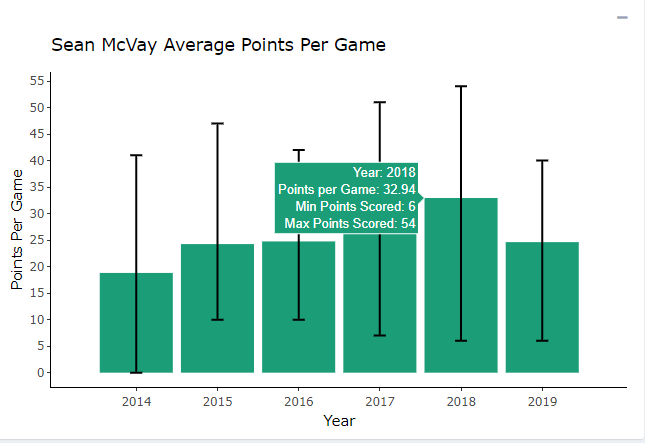
We see that there was a huge drop off in 2019 in the points per game for the Rams.
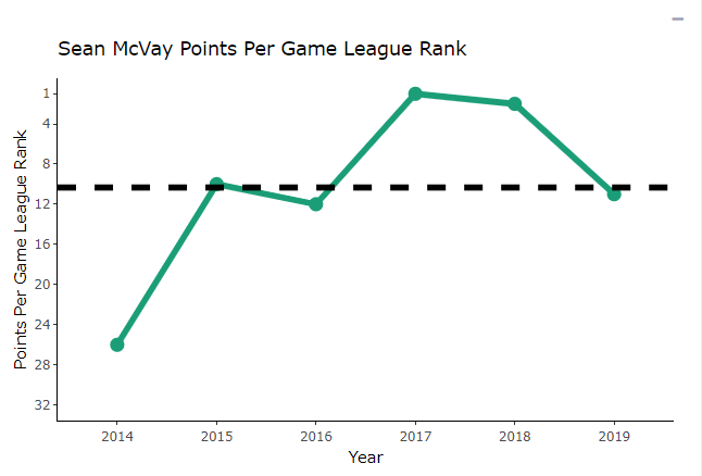
The second chart is a line chart that plots a coach’s points per game league rank (1 being the most and 32 being the least). The black dotted line is the selected coach’s average rank across all seasons coached.
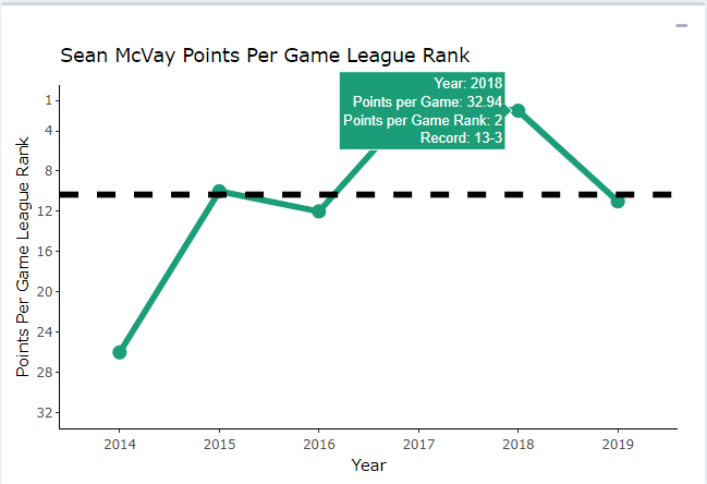
The first table shows the same data as the charts, just in table form.

The second table shows the team totals for stats like passing yards, rushing yards, touchdowns, etc., as well as the league rank for each of those stats (1 being the best and 32 being the worst).
Stats by Position
This page houses one chart and one sortable data table. Here you can find yearly stats like yards, receptions, touchdowns, etc., broken down by position and season under your selected coach or coordinator.
Use the buttons above the table to switch between positions and also numerical stats or stat ranks among the league.

For example, a one in the rushing attempt rank column for running backs would indicate that they led the league in rush attempts under that coach that season. Here we notice that Mike Vrabel has been pretty consistent in his rushing attempts his first two season in Nashville.

The chart below the table plots the target share given to running backs, wide receivers, and tight ends under the selected coach by season.

Yet again, hover over a section to reveal more data in a category.

Coaching Tendencies
This page houses two charts and a sortable data table. Here you can find cool team stats driven by nflscrapR play-by-play data. The table shows a breakdown of stats per season such as drives per game, yards per play, yards per drop back, red zone touchdown percentage, and much more.
The table is conditionally formatted by color on a red-to-green scale based on the NFL league average of those stats since 2009. Essentially, the worse you are under the league average, the cell color will go from yellow to red. A look at Matt Nagy shows how the offense has declined since his first season, especially in yards per play and yards per rush.

On the flip side, the better you are above league average, the cell color will go from light green to dark green and eventually blue (I ran out of greens). Red is awful, light red is not great, yellow is not good, light green is good, dark green is great, blue is phenomenal. A look at Bill Belichick shows why the New England Patriots have been so successful for such a long period of time.

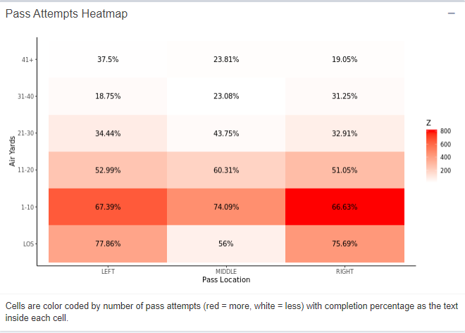
Below the table are two heatmaps. The first is a heatmap of pass attempts by air yards, colored on a white to red scale (white is bad, red is good).
The colors are based on the number of pass attempts in those zones, and the text inside is the completion percentage in that zone. Taking a look at Doug Pederson, we can see he likes to utilize the middle of the field between 1-10 yards a majority of the time when dropping back to pass.
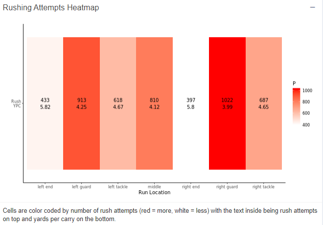
The second heatmap is by rush attempts through each gap on the offensive line, on a white to red scale. The text inside is rush attempts on top and yards per carry on the bottom. A peek at John Harbaugh’s coaching career indicates that he likes to run the ball over the right guard most often.
Coaching Tree
Coming soon! This will show a coach’s professional history to better understand coaching “lineage.”
Wrapping it Up
This is just one of many tutorials for the exciting tools we are integrating here at DLF. We hope you found this lesson helpful. If you have any questions on how to use this or any other outstanding features on our site please message me on Twitter at @FFJeffSmith or comment below. Thank you for reading.
- A View From The 1.XX Series Recap - April 24, 2024
- 2024 Coaching Changes: The Dynasty Impact of Antonio Pierce to the Las Vegas Raiders - April 19, 2024
- 2024 Coaching Changes: The Dynasty Impact of Dave Canales to the Carolina Panthers - March 24, 2024


