New Dynasty Tool Tutorial: How to Use Yearly Player Data
As part of DLF’s recent acquisition of FFStatistics, we are pleased to announce that the integration of tools has begun and they will soon be readily available to our premium subscribers. As each new resource is released, it will be accompanied by a “how-to” in order to familiarize our readers with the best way to utilize them for fantasy purposes. Next up is the Yearly Player Data App.
What is the Yearly Player Data app?
The yearly player data app is a multifaceted, powerful tool for measuring player statistics over a season. It can also be used to analyze and compare yearly finishes by more than one player.
This tool allows looking at annual positional finishes of one or more players, typically of the same position to gauge performance versus peers, and can be viewed as one or more seasons. This can be represented in graph format.
It also allows a deeper statistical and graphical dive into various aspects of the selected players’ performances. This includes:
- Position rank chart
- Rushing or receiving points per opportunity
- Yearly data table
- Consistency data table
- Points per opportunity
- Points per opportunity raw data table
There is a lot to cover about how this tool can be used, so let’s jump in. Go check out the Yearly Player Data app here.
Setting it up
For the sake of this tutorial, we will be looking at three running backs from the 2016 class: Todd Gurley, Melvin Gordon, and Tevin Coleman.
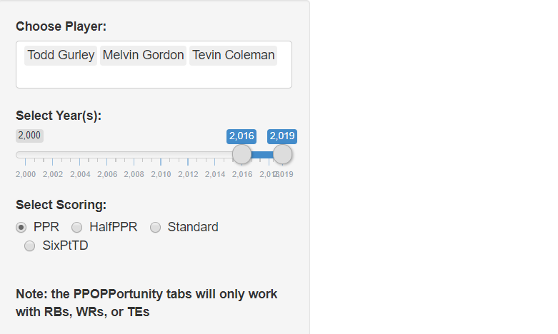
Once the player(s) are selected, choose how many years of data we want to analyze. Since all three of these running backs are from the same class, we have selected 2016 through 2019. Select the preferred scoring format and the data and graphs will populate. We will look at those next.
Yearly Finish
The top-most graph will depict a color-coded representation of the players and years selected.
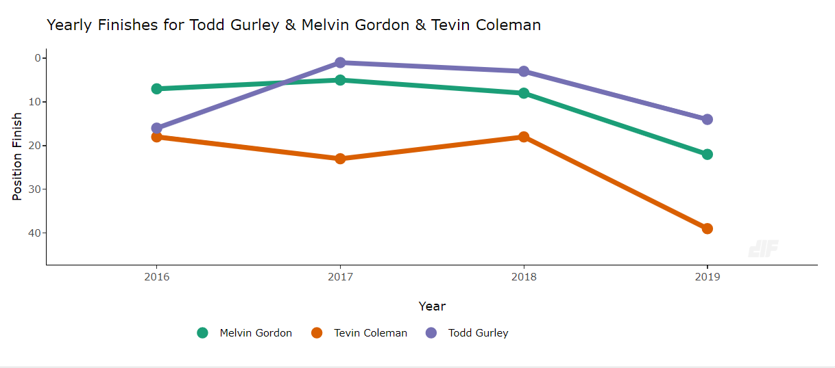
The graphical depiction is easy to read and fairly straightforward.
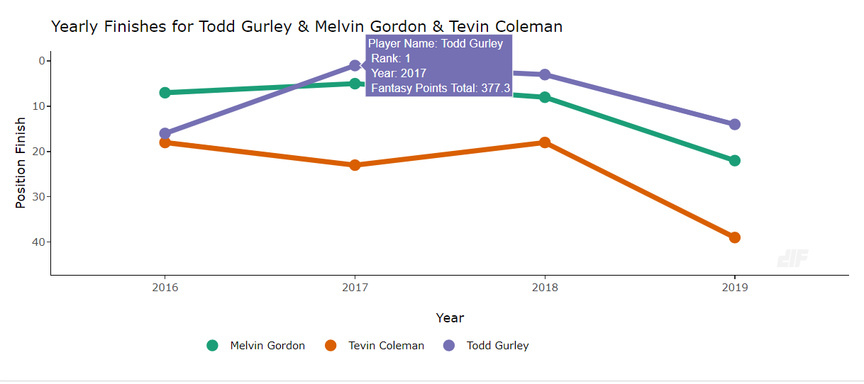
Hovered over the dots with your mouse to display further information. Rank, year, and fantasy points are calculated based on scoring format selected.
Position Rank Chart
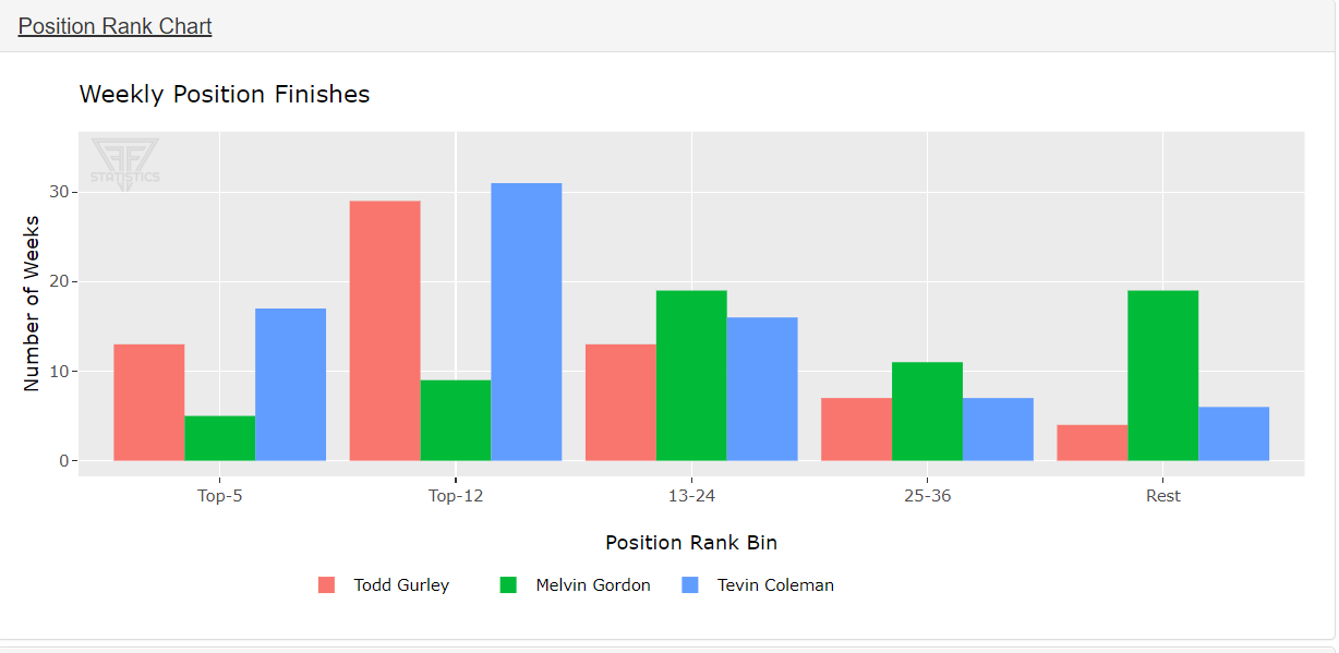
Next up is the position rank chart. This categorizes the selected players in a weekly positional finish. Want to know how many times Gurley finished as a top-five running back over his career? We have you covered with this tool.
Points Per Game Chart
Next up is the points per game chart.
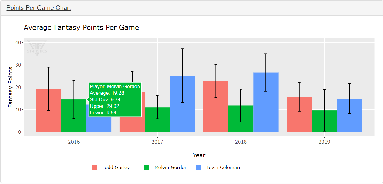
Again, in this chart the base information is viewable when it populates, but it also offers additional information. Hovering over a bar in the graph displays the player’s average points per game, standard deviation, and a range to show where the player fits in among other running backs.
Rushing/Receiving Points Per Opportunity
The next two charts are also very helpful when going through yearly data and comparing players of the same position.
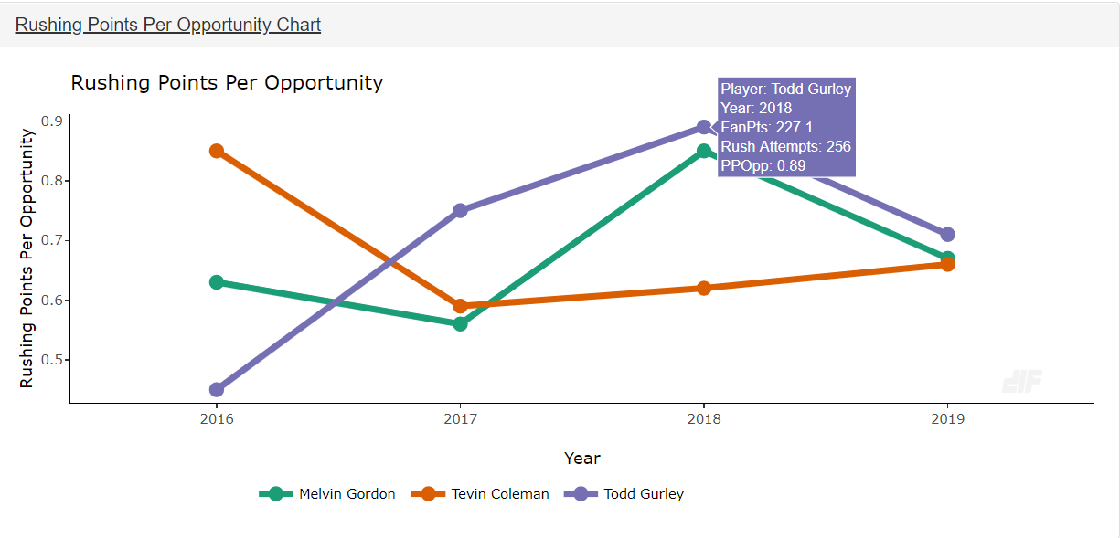
First up is rushing points per opportunity. Again, the dots display additional information when hovered over. It shows the total fantasy points based on rush attempts and averages out the points per opportunity. This is helpful in discerning how many points a player scored just on rushing attempts.
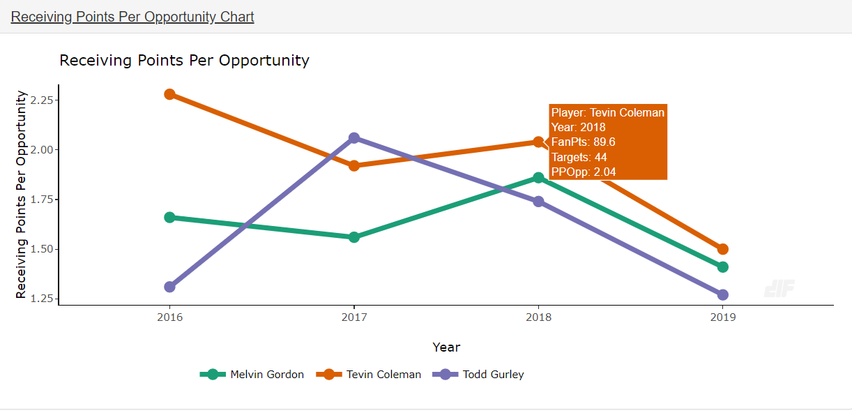
The next section shows a similar graph based on receptions and opportunity. There is a fun little fact some may not know. In 2018, Coleman scored more PPR points on a per-reception basis than both Gurley and Gordon.
One of the nice things this tool allows is seeing the breakdown of how a player scores their fantasy points.
Yearly Data Table
The next section shows various stats and information in spreadsheet format based on players and years selected.
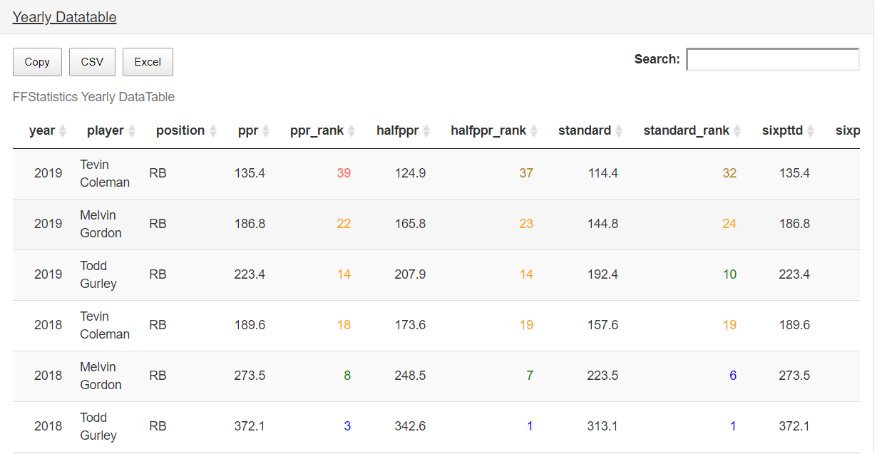
This allows a numerical look at various stats and ranks that are sortable by column and arranged by seasons selected.
Consistency Data Table
This shows some of the graph information available with some of the other tools but displays in a data table that is sortable.
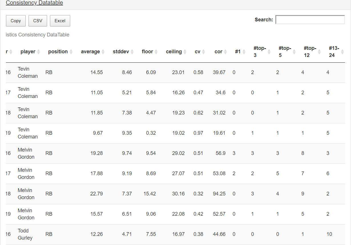
There are times where a player has a strong finish to a season but did not consistently show up for fantasy managers, such as Amari Cooper when he was with the Raiders. This data can show how often a player performed at a certain level. This is great for sifting through more consistent players versus some of the more boom/bust type of options.
Points Per Opportunity Data Table
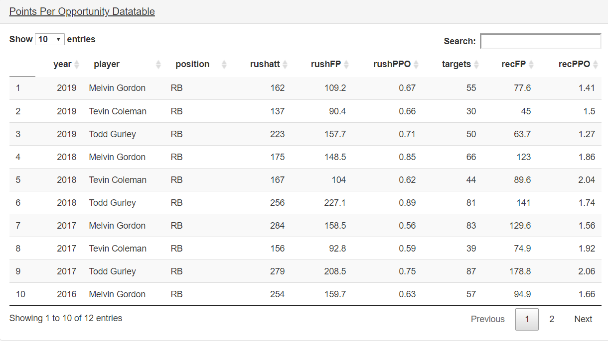
For those looking for just numbers, stats, and breakdowns of opportunity versus production, the PPO data table is perfect. It displays an array of stats based on opportunity and production. When comparing similar players, this tool can be very useful.
The consistency tools are a hidden gem when it comes time to draft a startup or a redraft league. Being able to compare ADP versus actual consistent production can often determine which player should be the better value.
Wrapping It All Up
This powerful tool can be used from draft season and throughout the rest of a season in a variety of ways. Everything from comparing ADP cost vs. actual production to tracking how a player stacks up among his peers from season-to-season is helpful for each offensive position.
This is the second of many tutorials on the new and exciting tools that will be integrated into the premium content at DLF. We hope you found this lesson helpful. If you have any questions on how to use this or any other outstanding features on our site, please message me on Twitter @john_hesterman. Thank you for reading.
- March Dynasty ADP Risers and Fallers - April 3, 2024
- February Dynasty ADP Risers and Fallers - March 12, 2024
- January Dynasty ADP Risers and Fallers - January 31, 2024


